To improve the appearance of some visualized data, you might want to add some curved edges to charts, legends, and slicers when they are added to a visual. Some of the different types of Chart (some Cartesian Charts, Segment Charts, and so on) allow rounded diagram shapes or tiles. While other items (slicers and legends) allow borders with curved edges.
It's important to note that the different "rounding" functionalities always apply a curve to the corners of the tiles, fields, or items. Where the radius is 0, the items have right-angles for corners. Increasing the radius adds a curve to the corners, making each tile into a rounded rectangle. The larger your Radius is, the more pronounced the curve is.
Rounded Bars
You can curve the corners of the bars on some types of Cartesian Charts using the Bar Start Radius and Bar End Radius options in the Formatting panel:
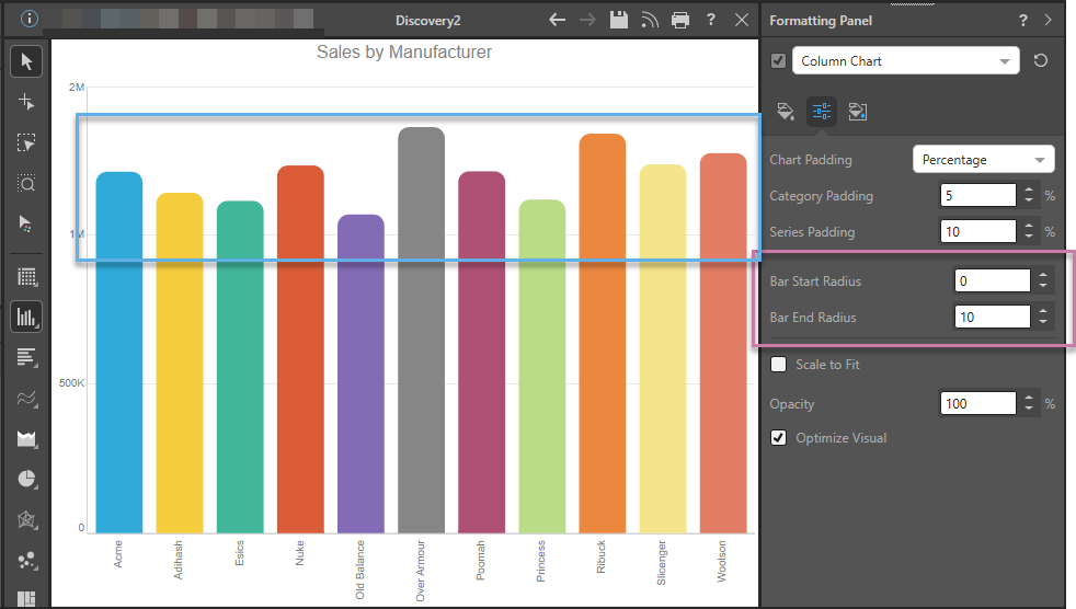
The Column Chart has the following relevant settings:
- Bar Start Radius is Zero. This means that, where the column meets the x-axis (at its start), it does not have curved corners.
- Bar End Radius is 10. This means that the end of each column (the furthest point for each, shown inside the blue box above) is curved with a radius of 10. You could increase or decrease this value to make the curved corners more or less pronounced, respectively.
Tip: When reading a chart that includes rounded shapes, you can see the exact value that the column or bar represents in a tooltip when you hover your cursor over it.
- Click here for more information about Formatting a Cartesian Chart
Bullet Charts
You can also apply Bar Start Radius and Bar End Radius settings to the bars in a Bullet Chart. The configuration is as described above.
- Click here for more information about Formatting a Bullet Chart
Rounded Segments
You can also curve the outermost corners of the "slices" shown in your Segment Charts using the Arc Radius setting in the Formatting panel:

The Pie Chart has the following relevant settings:
- Arc Radius is 10. This means that the outer angles for each "slice" (around the circumference of doughnut or pie charts, or between the slices of pyramid or funnel charts) are curved with a radius of 10. You could increase or decrease this value to make the curved corners more or less pronounced, respectively.
- This particular pie chart is "exploded" (see green arrow above). This means that clear divisions have been created between segments in the chart.
Tip: You might want to consider the formatting of your Data Labels here, to make sure it is clear what the slices of your Segment Charts represent.
- Click here for more information about Formatting a Segment Chart
Sunburst Charts
You can also apply an Arc Radius setting to the segments in a Sunburst Chart. The configuration is as described above.
- Click here for more information about Formatting a Sunburst Chart
Rounded Slicer Borders
You can make the outer border of a slicer (orange highlight below) curved, using the options in its Formatting panel:
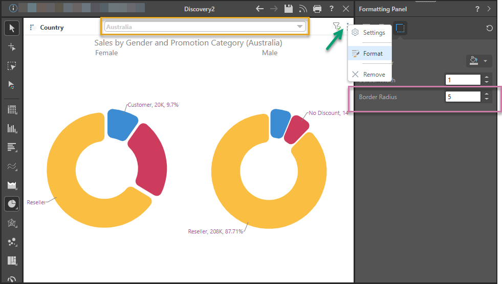
The Slicer has the following relevant settings:
- Border Radius is 5. This means that the border around the closed dropdown list has slightly rounded corners. This setting would have the same effect on a slicer that is rendered as buttons.
- The slicer is a dropdown list with the "Classic" slicer style. The other slicer styles do not display the dropdown list with a border outline, so there is nowhere to incorporate the curve. For more information about slicer styles, see Slicer Styles.
Tip: In addition to the Border Radius, you might want to use the other Border Formatting options to change the outline color and width and make your slicer more visible.
- Click here for more information about Formatting a Slicer
Rounded Legend Markers
You can give the markers in your Legend curved corners, using the Radius option in its Formatting panel:

The Radius is 3. This means that the individual markers have slightly rounded corners (green arrow above). This option has the same effect on the bar in a continuous legend:

- Click here for more information about Formatting a Legend
Tree Charts
You can also apply Radius settings to the tiles in a Tree Map Chart or Hierarchy Tree Map Chart. The configuration is similar to the Radius setting described above.
- Click here for more information about Formatting a Tree Map Chart
Related information
Alternatively, you might want to use the Rounded option from the Quick Styles to apply this and other related settings to your charts. For details of the different preset types, see: